Customer Service redesign
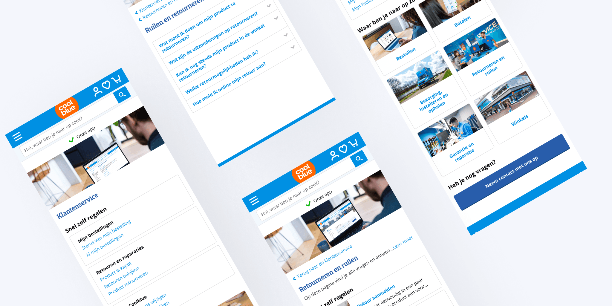
We redesigned all the customer service pages and flow at Coolblue, starting with a design sprint to set the vision, working on the final designs, and breaking them into feasible steps.
Scope: Redesign flow and customer service pages
Date: 2020

The previous customer service pages were a major pain point for users. The design was cluttered and lacked a clear hierarchy, making it difficult for users to find the information they needed quickly. Navigating between pages was also challenging, and a faulty search bar only added to the frustration. Recognizing the need to improve the user experience, I started working on design concepts for a redesign, as a side project. These early-stage concepts inspired the team, and we decided to take on the challenge of redesigning the entire customer service flow and pages to make it more user-friendly and to decrease the volume of support requests.
Redesign flow and customer service pages.
Create early stage and future vision concept, design new flow and pages from end-to-end.
5 developers, a scrum master, a user journey specialist, and a product owner.
The challenge of redesigning the customer service pages was a complex one. We started the project with many questions: How can we help customers find the best solution? What should be the focus on each page? How can we improve the user experience for both happy and unhappy customers? With so many teams involved, having a clear vision was necessary to ensure everyone was aligned, so we decided to conduct a Design Sprint, bringing all teams together to collaborate.
We collaborated with members from My Coolblue, the Customer Service team, and the Mobile App. Guided by the research insights shared by the UX researcher, we thoroughly analyzed the main problems with the previous flow and sought solutions through brainstorming sessions. Along with another designer, we crafted a design vision and set a direction for the future of the customer service pages.
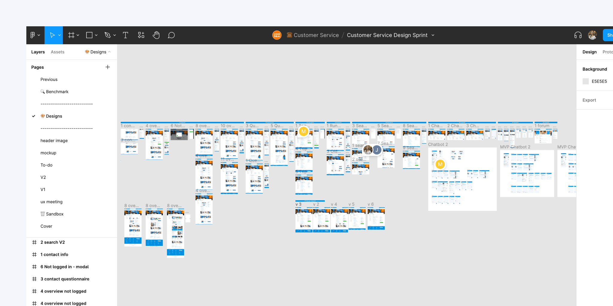
With a clear vision in mind, we were able to break down the redesign of the customer service pages into manageable steps. This first roadmap project prioritized the most impactful but feasible elements from our vision, with one limitation being the search bar, which would be implemented in a later phase. To compensate for the lack of search functionality, it was crucial for us to make the pages easy to scan and find information.
We decided to change the flow of the customer service pages. Instead of presenting users with pages filled with information, we added a new step to better guide them to the information they needed. The new flow starts by asking users what their question is about, then directing them to a general category page with relevant information. If further information is required, they are then led to a topic page with specific answers to their question. This approach presents less information at each step, guiding users to the most relevant information only when needed, instead of overwhelming them with too much information at once.

We conducted usability tests on the new flow and received valuable insights. Users found the redesigned pages easy to navigate and could quickly find the answers to their questions and access self-service actions. We also introduced a side menu, which proved to be very useful during testing. Users could easily switch between pages and categories and had a clear overview of all topics available for navigation.
However, we also learned that the hierarchy of the page needed improvement and that key information, such as category entrances, should be placed higher than secondary elements like login nudges.
Based on this feedback, we iterated on the designs and arrived at the final versions, ready for A/B testing.
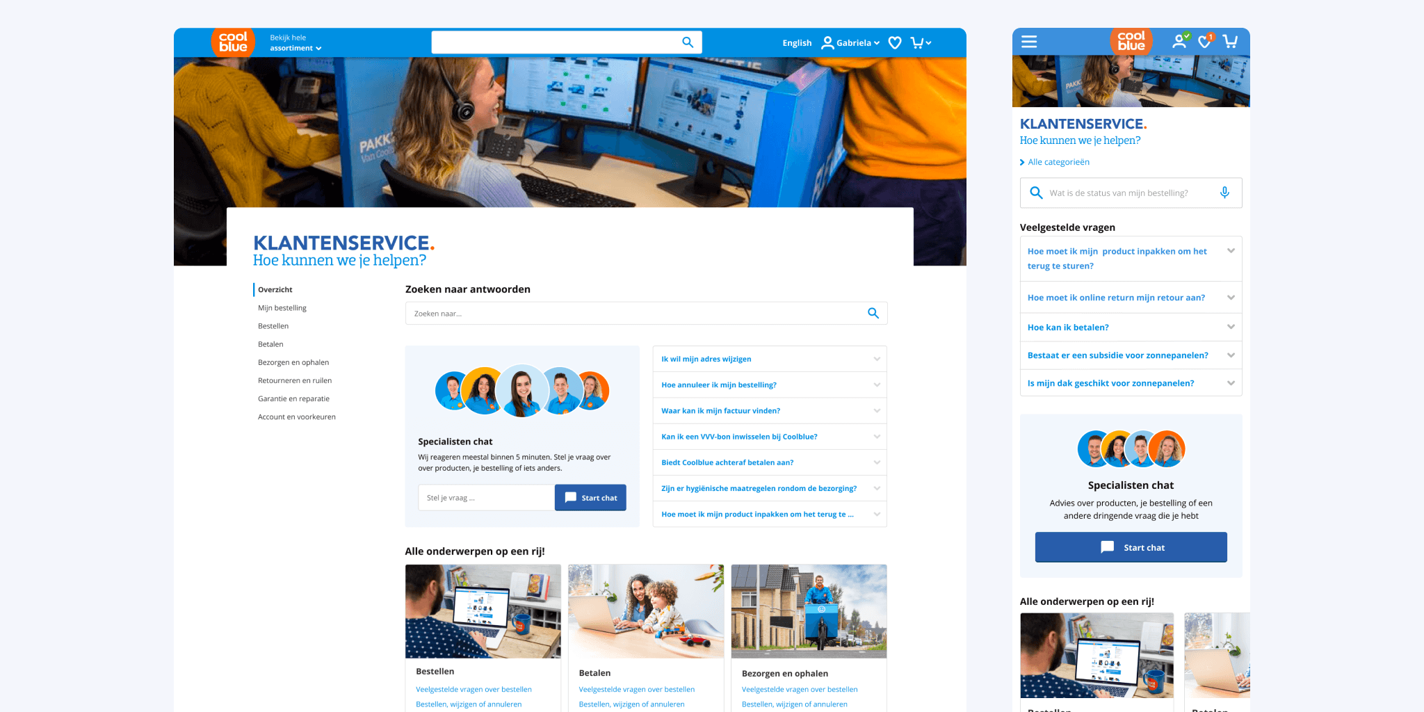
The new flow is designed to guide users through the process of finding answers to their questions, by presenting relevant information with a design that is clear and easy to use.
The flow starts on the homepage, where we've placed the most common self-service actions at the top of the page to prioritize them in terms of hierarchy. From there, users are prompted to select the category that best matches their question. If users prefer to speak to someone directly, the contact information for Coolblue is conveniently located at the bottom of the homepage for easy access. This new flow is designed to make the process of finding help and information as smooth and intuitive as possible.

The category pages are designed to be user-friendly, providing an overview of the information available in each category, with a clear hierarchy that guides the user to their desired information. We highlight the most frequently asked questions in that category, making it easier for users to find the information they need. The self-service actions are placed at the top of the page, ensuring quick access to common actions.
Under the FAQs, we present entries to topic pages which provide more specific information on that subject. The hierarchy of the page is designed in a way that users can easily find what they are looking for, without getting overwhelmed with too much information.
To help users find related information, we also place links to related categories at the bottom of the page, allowing them to easily switch between topics.
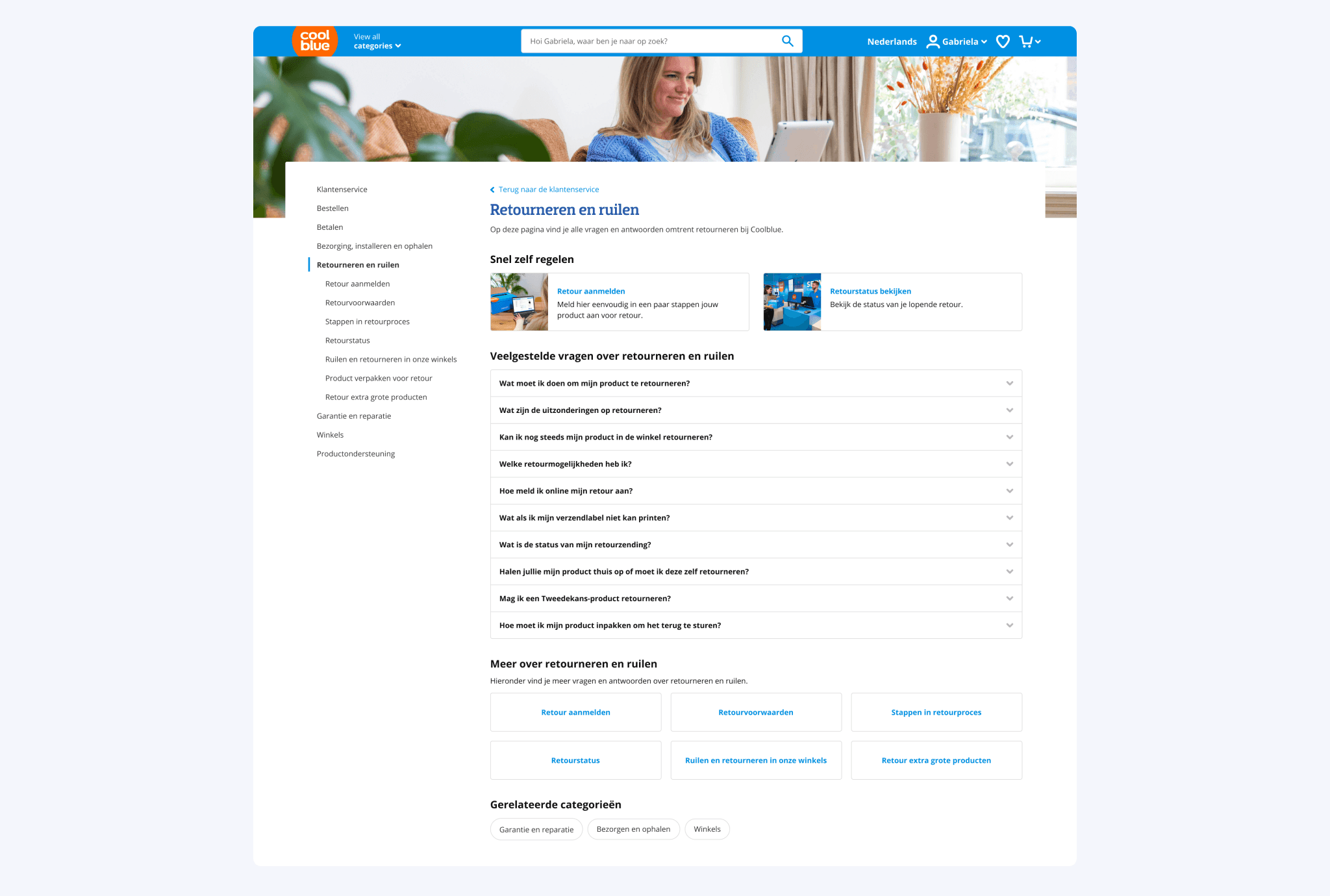
The topic pages provide users with answers to more specific questions. The information is presented in a clear and concise manner, with a list of collapsible frequently asked questions so users can open multiple answers easily. The side menu is a key navigation tool, and becomes even more important at this stage, as it helps users easily switch between different topics or categories, or even go back to the homepage if needed.

The results of our new customer service designs were very promising. The A/B test of the new flow and designs showed a significant decrease of 6% in the customer contact ratio and an increase in the click rate of self-service actions.
We are continuously improving the design by incorporating user insights and feedback, especially by making it more personalized for each user journey. We have now developed a new search on the customer service pages to make it easier for users to find answers to their questions and we streamlined the contact flow by introducing a wizard that recommends the most efficient way of contact for each type of question.

